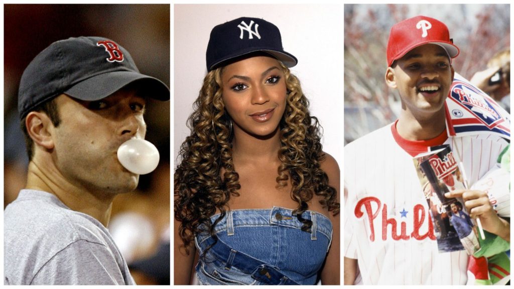
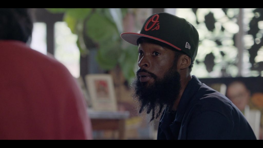
The best observations are literally sitting there right in front of you, but you get too caught up in all the what if’s to realize them.
I was catching up with some UK colleagues this past week in New York, and we were talking about MLB’s decision to continue to expand its footprint into the UK over the next few years. It is a good effort on the part of baseball to raise not just awareness, but marketing activations across the Atlantic, and London has been an accepting safe haven for American sport as we have seen. However they pointed out, baseball has had a built in brand advantage from a sales and identity standpoint that no other sport has, one I had never fully considered.
“The world loves caps, especially American caps, and no matter where you go in the world you see MLB caps. Why? They are the only business in the world who traditionally have the initials of the city they play in right there for all to buy. If you like New York, you have the Yankees, NY. LA, there is the Dodgers cap, San Francisco or Chicago, you have those cities in whatever color you want. It doesn’t have much to do with baseball, but it is a great subtle way to see how caps show up around the world, unlike any branding spend any team can do. Whoever came up with the idea over 100 years ago should get a royalty!”
Even with team rebranding…the Indians to the Guardians for example, the “C’ stayed front and center on the hat. The Nationals have rolled now new styles this year, all with a “W” right in the middle. If it sells, keep it there. It’s what people like.
It reminded me of an urban legend I had heard about several years ago, as the New York Yankees and Manchester United created a first-ever global business partnership, one which fizzled pretty quickly. What was the impetus? The story goes that the late Yankees owner George Steinbrenner, was travelling in Europe as part of his role with the US Olympic Committee and saw all these Yankees caps in every color wherever he went. He assumed that somehow all these random people were Yankees fans. In reality they just liked the cap because of the interlocking NY.”
The conversation was a stark reminder of how necessity and simple needs take precedence over even the buzzworthy of campaigns. People like hats, we sell them hats. People like American cities we put initials on the front and leave it at that. Sure we can have new niche styles, and there are three teams…The White Sox, the Brewers and the Blue Jays who have the team logo as their primary cap…but the reality is the city letters identify and sell with people regardless of if they have ever picked up a baseball, and that’s a nice little intangible MLB has in places even where the only diamond, is one in a wedding ring.
Hat’s off MLB, rather be lucky than good sometimes.


